— Private wealth · Advisory
Quiet authority,made findable.
The engagement, chapter by chapter
01 The client
Referrals only, and slowing.
A twelve-person advisory firm whose clients had always arrived by introduction. The introductions were still coming, but from a generation that was retiring — and their children were searching first and asking second.
02 The challenge
Credibility that does not survive a search.
The firm read as serious in a room and as invisible online. The site was a decade old, the partners' expertise existed only as PDFs, and the phrases prospective clients actually type had no page to land on.
The risk in this sector runs both ways: look too commercial and you forfeit trust; stay silent and you are never considered at all.
03 The strategy
Publish the thinking, quietly.
We positioned the firm around patience — long horizons, few clients, no product sales — and built a small library of genuinely useful writing around the decisions clients face, mapped to real search demand rather than keyword volume.
No gated downloads, no newsletter modal, no chat widget. Authority is demonstrated, not captured.
Look too commercial and you forfeit trust. Stay silent and you are never considered.
04 The experience
Restraint as a trust signal.
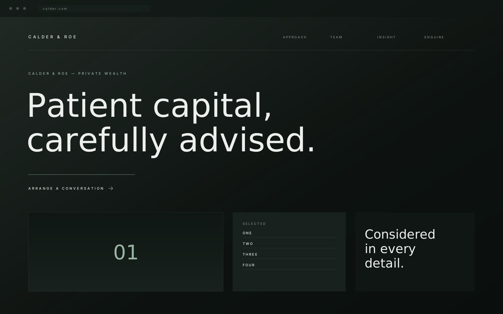
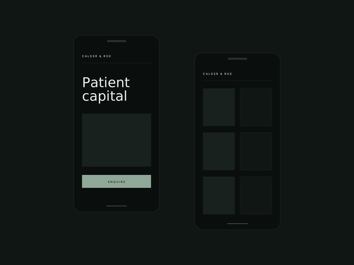
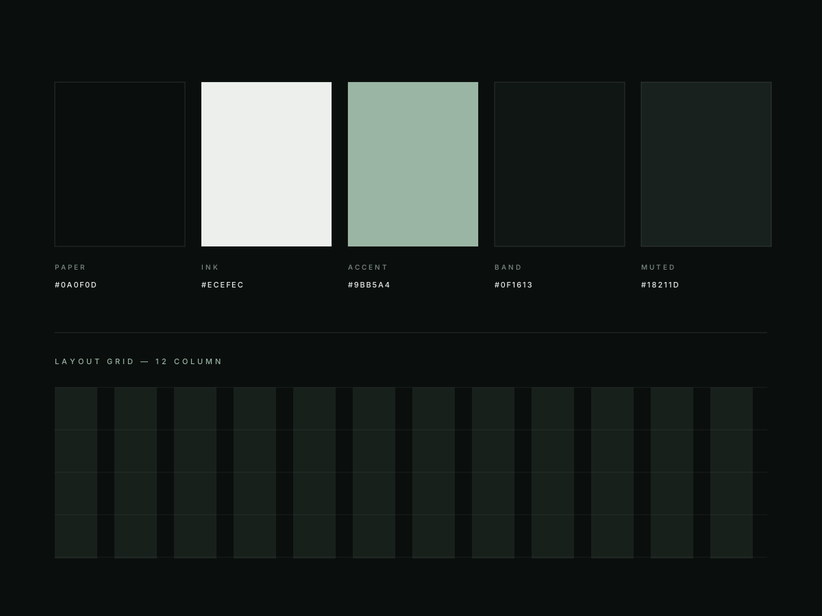
Deep green, ivory type, a generous measure and almost no ornament. Partner profiles lead with judgement rather than credentials, and every page ends with the same single, unhurried invitation to talk.
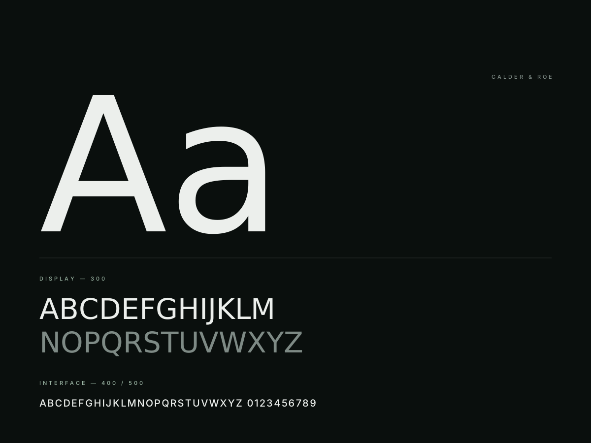
The insight library is designed for reading: one column, real line height, and a typographic scale that holds at every width.
05 The build
Structured for search and for people.
Server-rendered pages with clean semantic structure, schema for the firm and its people, internal linking planned rather than incidental, and a CMS that lets advisers publish without breaking the layout.
Accessibility was audited to WCAG 2.2 AA before launch — non-negotiable for an audience that skews older.
06 The result
A firm that can be found and still feel private.
The site launched with the new position, thirty pages of substantive writing and a search foundation the firm continues to build on, without a single tactic the partners would be uncomfortable explaining to a client.