— Property development · Manchester
Twelve residences,sold from one page.
The engagement, chapter by chapter
01 The client
A developer, not a marketer.
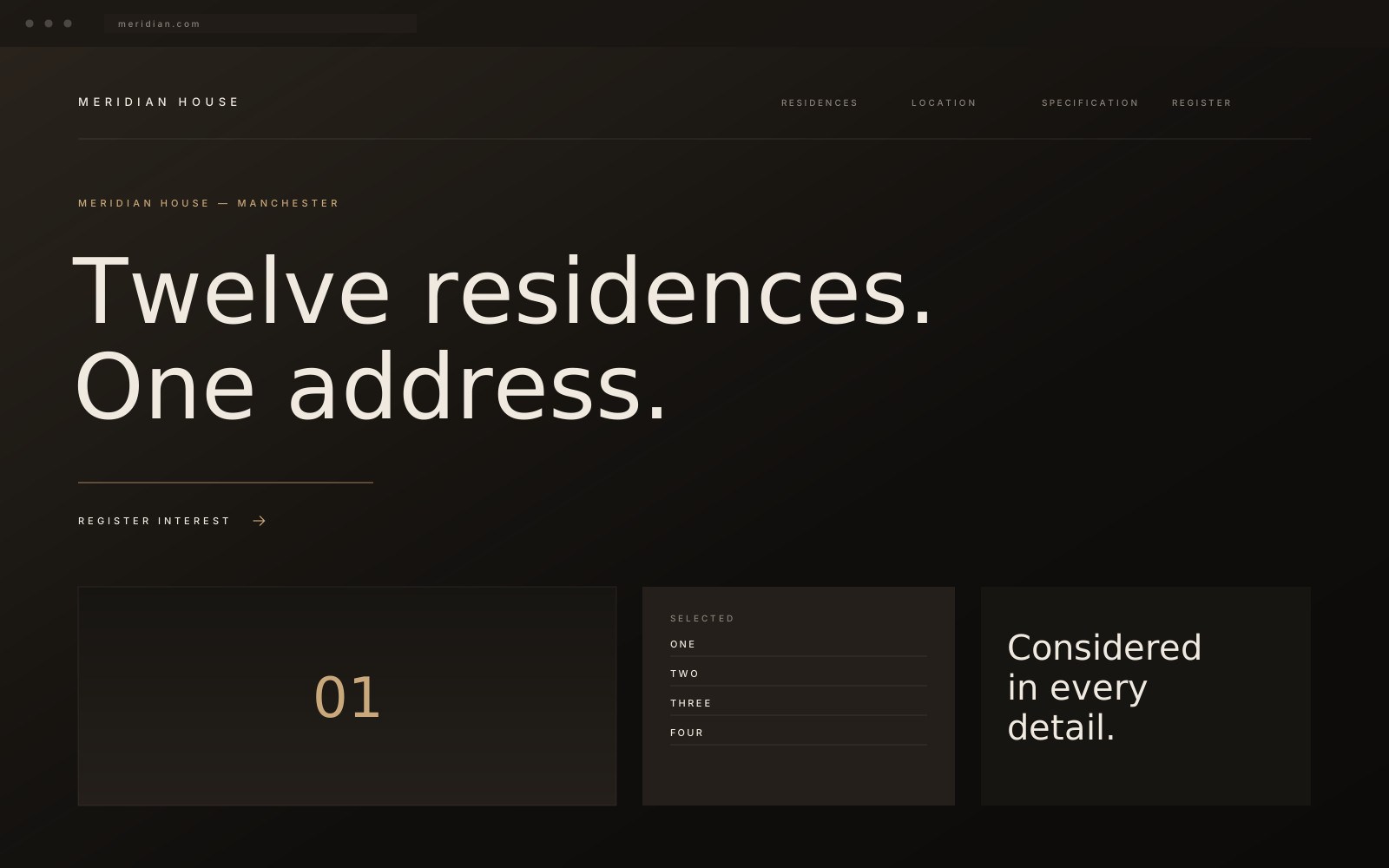
Meridian House is a twelve-residence conversion in a listed building. The developer had built carefully for two years and had eight weeks to present it — with a brochure site put together by the estate agency and photographs taken on a grey afternoon.
The building was better than anything being said about it.
02 The challenge
The buyer decides in ninety seconds.
At this price a buyer is not comparing floor plans. They are deciding, almost immediately, whether the developer has taste and whether the building will be finished to the standard implied. Every signal on the old site — stock imagery, a cluttered enquiry form, a slow gallery — argued the opposite.
There was a second problem. Agents wanted a portal for reservations; buyers wanted calm. Those two needs had to live in one product without the second ruining the first.
03 The strategy
Sell the address, not the amenities.
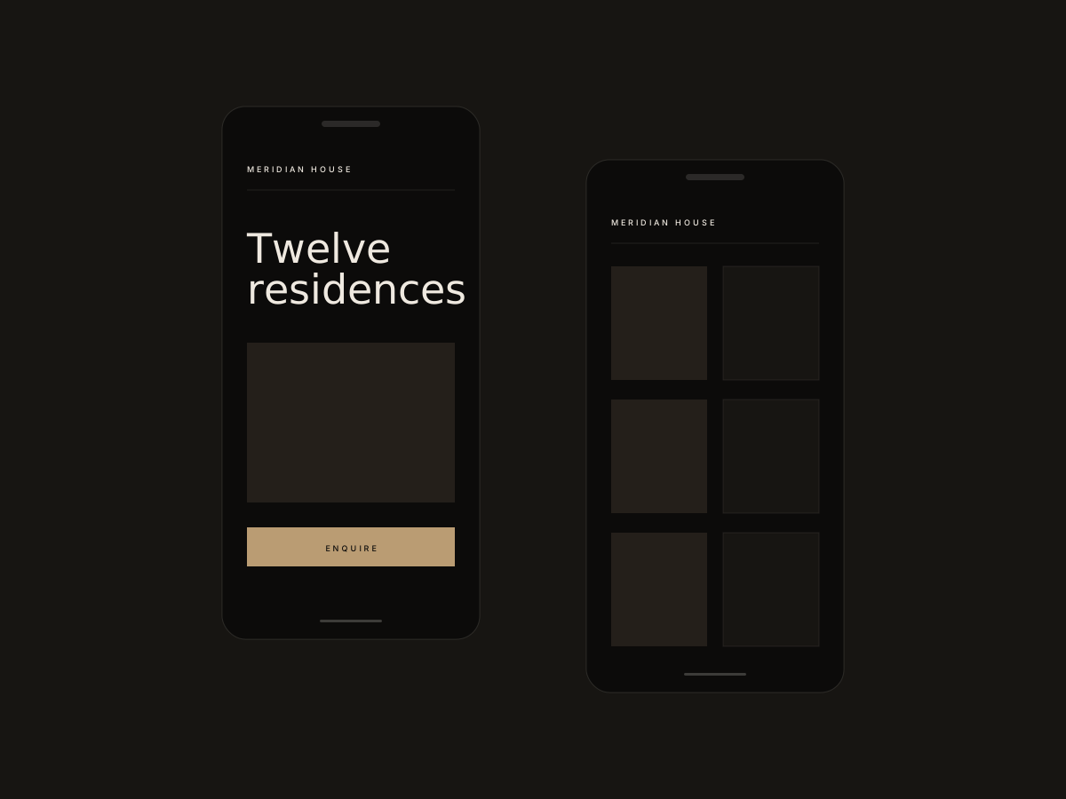
We rewrote the position around place and permanence rather than specification. Amenity lists moved behind a single, quiet link. The homepage was reduced to one line, one photograph and one action.
The reservation portal was separated entirely: same identity, different room. Buyers browse; agents transact.
The building was better than anything being said about it.
04 The experience
One page, unhurried.
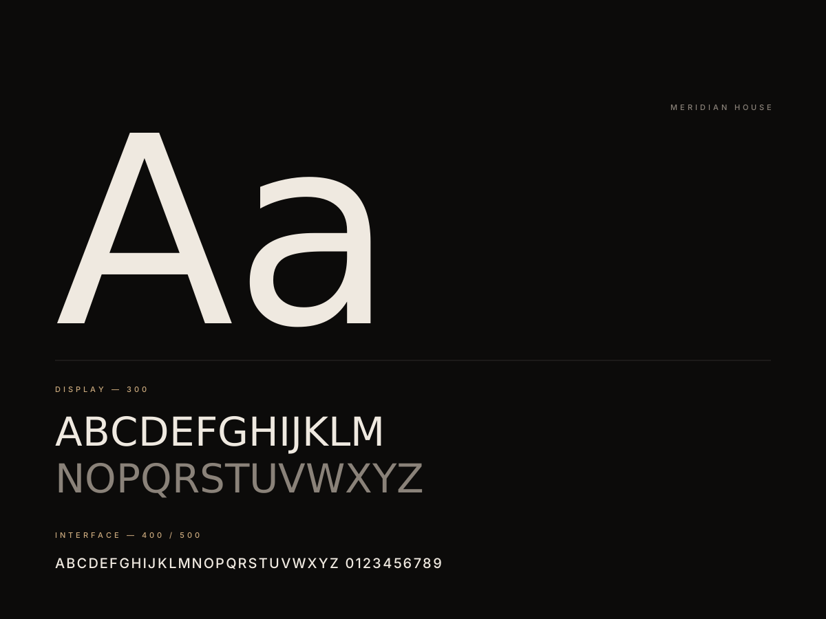
A single scroll: the address, the light, the plans, the specification, the register. Typography carries the weight — a high-contrast serif at display sizes, wide-tracked capitals for navigation, and generous space that reads as confidence rather than emptiness.
Photography is shown full-bleed and uncropped on mobile, art-directed per breakpoint rather than letterboxed. Motion is limited to reveals that follow the reader down the page.
05 The build
Static, instant, indexable.
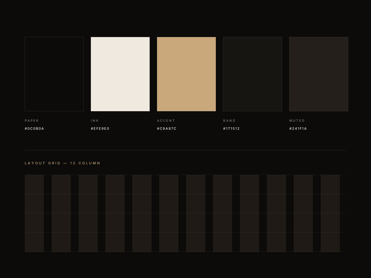
Hand-written front end, statically rendered, served from the edge with responsive AVIF imagery and a hard performance budget. The reservation portal runs as a separate authenticated application against the same design tokens, so the two never drift apart visually.
The developer's team updates availability from a CMS that offers exactly four fields, because a sales team should not be asked to operate a publishing platform.
06 The result
A release that looked finished before it was.
The site launched in nine weeks with the identity, the marketing site and the agent portal in place, and it now reads the way the building does — considered, quiet and expensive.